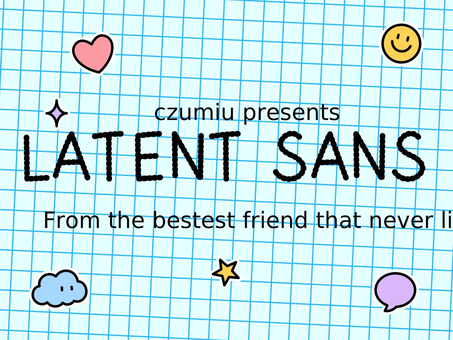
There’s a handwriting you’ve likely seen and never noticed.
AI image generators have a default style, a way of drawing they fall back on unless you push for something else. The handwriting is part of that default. Ask a model for an image with handwriting in it, and the letters come back the same way almost every time, whatever the prompt and whoever asked. It’s the model’s own invention, a handwriting that lives only inside the pictures it makes. Once you can spot it, it’s one of the clearest signs an image came from a machine.
I saved samples for months and studied them, and tried tracing the raw ones, but the details came out a little different every time. I asked an image model to turn the clearest sample into a type specimen, and it drew one in a single pass, a clean sheet of its own letters. Even with a background in vector tracing, it was still a challenge. I built each letter from strokes of one even width. The trouble is geometric: the wider an even stroke, the more its inner edge pinches where the line curves tightly, and past a point that pinching is unavoidable. Even thin strokes pick up kinks that look unnatural. Smoothing those out was the hard part.
Type your own words:
Then I tried writing in it by hand, and the reason it’s hard to learn is the same reason it reads well. The tails change from letter to letter, a full curl on one, a half curl on the next, a bare stop on another, and which letter gets which is something you can only memorize. That same variety keeps it readable. Letters that look distinct are easier to read at small sizes, and the changing tails are what set them apart. The training rewarded handwriting that reads clearly. Writing it was never part of the training, because the people making these images work in prompts. So the variety you memorize to write it is the same variety that lets you read it.
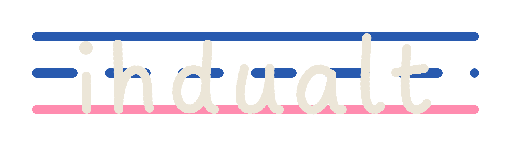
This started as an experiment, and it got more thoughtful discussion in the font community on Reddit than I expected. Someone there said it would make a good children’s font, so I leaned the whole presentation childlike, grid paper and stickers. The childishness is all in the frame around the letters. I never touched the glyphs.
To show the font in use, I made a few pieces alongside it, each built to push the same idea: making something human look machine made. The handwriting did part of that. Color did more. AI images tend to come out with a warm, yellowish cast, whites going cream and everything a little golden, and people have learned to read that look as a sign of AI. I tinted mine to match and kept the shapes plain.
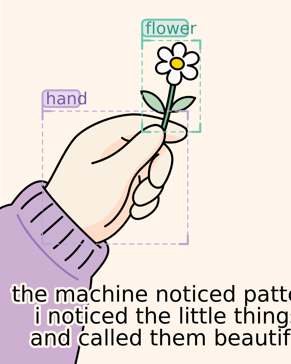
Handwriting is the most personal mark a person makes. A machine pooled this one from all of us, and now it’s yours, free under the SIL Open Font License.
Read the source on GitHub.
Hover a glyph, click to copy it.